
Active GUI element
Static GUI element
Code
WPS object
File/Path
Command line
Entry-field content
[Key combination]
Head to Head
Thinkpad T30 running eComStation 1.2 versus Macbook Pro running MacOSX Tiger 10.4
Introduction
eComStation (aka: eCS) is an OEM version of OS/2 Warp 4, and with its user interface enhancements has made OS/2 much prettier and user friendly.
In this article I compare an IBM Thinkpad T30 running eCS 1.2 with a MacBook Pro running MacOSX Tiger 10.4.8. The reason for doing so is that I recently bought a MacBook Pro and I wanted to know whether Tiger is as good or better than eCS.
I am an old timer when it comes to computers having cut my teeth in the early 1990s on Unix boxes like Sun SPARCs running SunOS and IBM RS6000s running AIX. My PC at that time was a 486/33 MHz Gateway PC running DOS/Win 3.1 and of course, anyone in those days knew that Win3.1 was a terrible multitasker and was plagued with instabilities. Despite its shortcomings, there wasn't much choice: Linux was still in its infancy, and WinNT was late.
It was at this point in history that IBM brought out OS/2 2.0. I bought a copy of OS/2, installed it on my PC and became hooked on it to this day despite its quirks. I found OS/2 to be a good multitasker with good stability compared with BSD (AIX was a piece of sh*t for a while) and the WPS was so much better than Win3.1 and all the X window managers combined. This was in 1992 and despite its many improvements since then, the development and support of the OS/2 kernel slowly languished.
Warp 4 was the last incarnation from IBM but an OEM version from Serenity Systems International (SSI) called eComStation (eCS) continues to this day. It became the preferred version of OS/2 because of its improvements to the user interface and installation process. Unfortunately, SSI does not own the OS/2 source code and thus when development was finally stopped by IBM at the end of 2006, the future did not look too bright. The recent announcement that Scitech was going to sell off its video drivers woke me up to the reality that eCS may be near the end of its life despite the fact that eCS 2.0 is in beta 4.
Don't get me wrong, I will continue to do my work on OS/2 but I have to hedge and look at other OS's. M$ WinXP is an inferior choice. (My colleagues cannot believe how much swearing comes out of my mouth when I use it at work.) Linux is really a server OS at this time. What is left is Tiger. My buddy who is a Mac evangelist told me that Tiger is the next best thing since sliced bread and so without having too much of a choice, I bought a MacBook Pro for Christmas.
The Laptops
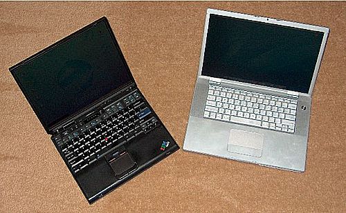
Figure 1. Here's the picture of my laptops sitting side by side. The T30 is on the left and the MacBook Pro is on the right. [Larger image]
The specifications of the two machines are:
T30 Specifications
- Pentium IV 2.0 GHz, 256 MB of memory.
- 14.1” (35.8 cm) screen 1400x1050 32 bit colour. ATI Mobility Radeon 7500.
- DVD/CD-RW.
- Touchpad and Trackpoint.
- 10/100 Mb Ethernet, WinModem, Bluetooth and Wifi.
- 1x serial port and 1x parallel port.
- 2x PCMCIA slots.
- 2x USB 1.0.
- Running eCS 1.2.
- 1.5” (4 cm) thick, 5 lb (2.2 kg).
- Bought in 2003. Cost $2399.
MacBook Pro Specifications
- Core 2 duo 2.33GHz, 2 GB of memory.
- 15.4” (39 cm) wide screen 1440x900 32bit colour. ATI Radeon X1600.
- Superdrive: DVD+/-R, CD-RW.
- Touchpad.
- Camera.
- Gigabit Ethernet, Bluetooth and Wifi.
- ExpressCard/34 slot.
- 2x USB 2.0.
- 2x Firewire.
- Running Tiger 10.4.8.
- 1.0” (2.5 cm) thick. 5.6 lb (2.5 kg).
- Bought in 2007. Cost $2350.
From the above we can see the MacBook Pro has a faster processor (in fact 2 processors), more memory and a bigger screen and is cheaper than the T30 even before adjusting for inflation. So besides the obvious hardware improvements between 2003 and 2007, how does the T30 compare with the MacBook Pro in usability?
MacBook Pro Hardware Critique
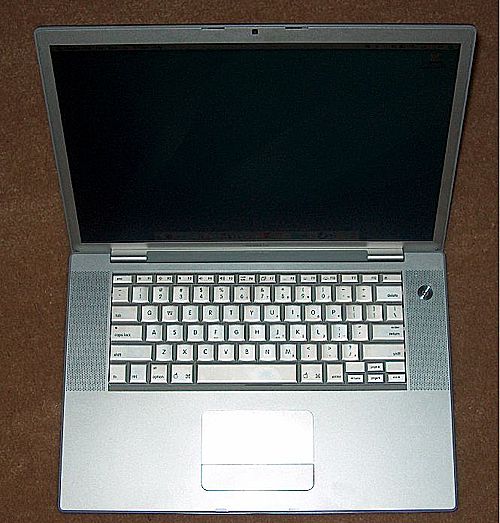
Figure 2. My MacBook Pro 15.4“ Core 2 Duo [Larger image]
The MacBook Pro is really beautifully designed with its silver colour and the cool Apple Logo on its cover. It is thinner than the T30 by quite a bit, it is physically larger and a little heavier than the T30. The first thing that is impressive is the large bright LCD screen. When I log in for the first time, the Mac takes a picture of me and gets me to set the superuser password.
After that it boots up to a rather bland desktop (see Tiger vs eCS). The other impressive thing about Tiger is that it boots up really fast, in about 10 seconds and it is immediately usable. (Compare WinXP which pretends to boot up quickly to the desktop but does not allow you to do anything for 3 minutes and this is on a Pentium IV 3.2GHz with 2GB of memory!! eCS boots really slowly on my T30, it takes between 3 to 5 minutes (what do you expect from an old OS?)). Oh! Another cool feature is the backlit keyboard which automatically lights up in a darkened room to illuminate the keys. The MacBook also comes with infrared remote which allows me to control some programmes like the DVD player.
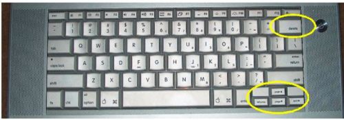
Figure 3. The zoomed in view of the MacBook Pro keyboard. The yellow ellipses circle the “delete” and cursor keys [Larger image]
So what's wrong with it? When I look at the keyboard, the first thing I ask is, “Where's my Backspace key?” The key that is labeled “delete” is really backspace and so there's no “delete” key! And “Where're my Page Up and Page Down keys?” The keys which are labeled “page ^” and “page v” are really cursor up and cursor down keys. So with a bigger laptop and more real estate, I have fewer keys! This is really annoying especially for a guy who uses the delete key and page up/down keys all the time. (Before any Mac afficionados tell me how to do a page up or down, I know that fn+cursor up/down keys do page up and down; and a real in-place delete is fn+delete.)
What I love about the T30 is the trackpoint, missing on the Mac. (Dell trackpoints are done completely wrong. I'll forgo a
tirade about Dells and would never buy one.) I know other people swear by the touchpad, I don't really like it but
I can live with it. Plus I bought a bluetooth mouse for the MacBook and so this problem is easily overcome. In
reality Mac programmes now use the right mouse button and of course the MacBook Pro doesn't have one; it is
simulated with the Ctrl key. Times have changed and Apple should just shift paradigms about the single mouse button
and go to three because Tiger is really a Unix box and Unix boxes have traditionally used three mouse
buttons.
Tiger vs eCS
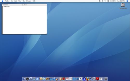
Figure 4. The Tiger desktop. The user interface is called Aqua. [Larger image]
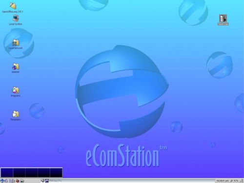
Figure 5. The eCS desktop. The user interface is the Workplace Shell. [Larger image]
Is Tiger's Aqua a better user interface compared to the eCS Workplace Shell (WPS)? Well, the first thing that you notice when Tiger starts up is the Finder bar at the top of the screen. The bottom of the screen is the DOCK which is equivalent to the eCS taskbar.
Menubar (Finder)
The paradigm of Aqua is to have a single menubar at the top and not in a separate window for each app like in Win$ and eCS. This takes a little bit to get used to. To use the menubar of the app that I want, I have to click on the app first and then go to the menubar.
Icons
One thing really cool about the icons in Aqua is that they are vector and not bitmapped and so resizing the icons does not affect their appearance.
Command line
The xterm window shows the decorations from the Quartz window manager. Like eCS, Tiger out of the box does not run X-Windows straight up but must be installed separately. This version of XFree86 is better integrated into the OS than XFree86 for eCS. First the X windows appear on the desktop and not in a separate video environment. The X server (version 6.6) is fully supported by Apple. The eCS version is only at 4.4. Like in eCS, XFree86 in Apple lives in its own separate universe and drag and drop is not supported. Furthermore, because Tiger is really Unix, it has no problems with character I/O; eCS has problems dealing with commands like telnet in xterms. Therefore xterms are not that useful in eCS and so I usually use command windows (CMD) instead. Unfortunately, these command windows are not resizable with the mouse and there's no scrollbar which really sucks. Even WinXP command windows are resizable and so this is a sorely missed feature in eCS.
DOCK
The DOCK is equivalent to the eCS taskbar. The DOCK looks cool but takes up way too much room. Apps which are running live to the left of the waste basket and have a little triangle pointing to its icon.
Figure 6. Apps which are running have little triangles at the bottom of their icons. [Larger image]
Figure 7. Minimised apps live between the vertical bar and the waste basket. [Larger image]
Because it takes up so much room, the first thing I did was to send it off the desktop and have it pop up only when I move the mouse to the bottom of the screen.
Multiple Desktops
One thing that is sorely missing in Tiger is multiple desktops. Supposedly this will be added in Leopard. Having multiple desktops is a really old idea that has been in every version of X server ever since I can remember. But is missing in Tiger. The multiple desktop app, VirtueDesktops (it is really similar to the free multiple desktop product from M$ for WinXP), which I'm using, really sucks compared with the multiple desktop from eCS. Since this is not an Apple product, I'm not going to criticize it too much. Hopefully Leopard comes to the rescue and does it right.
Resizing Windows
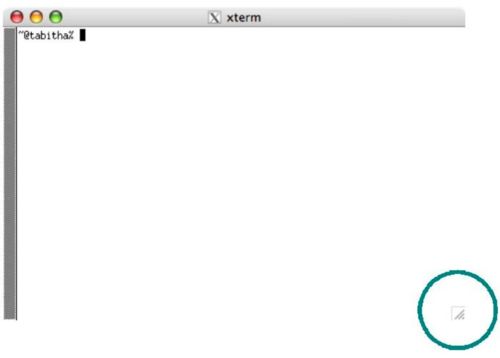
What was Apple thinking when it came up with the way to resize windows? The only way to resize the window is to drag the small little triangle on the bottom right of the window (highlighted with the circle)
Figure 8. The small triangle (highlighted with the circle) is the only way to resize the window. [Larger image]
eCS and most other OSs got it right here. All windows can be resized by dragging any edge of the window. Apple should fix this nonsense.
Autofocus without Autoraise
This feature may be impossible in any version of MacOS because of its paradigm: to set the focus of a window when the mouse pointer is over it without raising it to the foreground. eCS does this; all X servers have this feature. I really like to type in a window in the background by just moving my mouse pointer onto it and not bring it to the foreground.
Quitting an Application
Why is quitting an app so illogical in Tiger? The 3 buttons at the top of every window do not mean what the rest of the universe thinks they mean.

Figure 9. The Tiger minimize and maximize buttons
The red button kills the current window but NOT the app. This means that the app is ”zombified” and still remains in memory! To kill the app I have to do an apple-Q. This is not true for X apps, the red button does kill the app. This inconsistency is surprising for a mature OS.
Installing and Uninstalling Apps
This is really cool. Most apps come as a dmg file which, after I open it, I just drag the app in the dmg folder to the destination folder and everything gets installed correctly. The wpi files of eCS is similar to dmg. However, the similarity ends here, when I want to deinstall, I just drag the app to the waste basket and magically the app is deinstalled. The reason for this simplicity is because most Mac apps are well contained and so this method works. However, eCS (like WinXP) has crap left in the registry files or ini files and so a method of tracking is necessary for deinstallation. That's one up for Tiger!
Look and Feel
There is just no simple way to change the entire look and feel of Tiger. Just look at the large number of options for eCS in Local System > System Setup > Appearance compared to Tiger's Preferences >Appearance—it's the difference between heaven and earth! Unlike eCS which has eStyler themes and Window themes which comes out of the box, I have to buy a $20 utility called ShapeShifter to alter Tiger's user interface.
One thing that is sorely missing in Tiger is the “click on right mouse button on the desktop” and a menu popping up for me to launch apps. There is a free utility called OnCommand which allows me to set up apps to launch, but it is really primitive compared to the Extended Menu Options in eCS.
Cool Apps
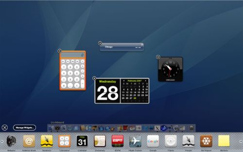
The coolest bundled apps which come with Tiger are the Dashboard apps. Shown here are the widgets which come with Tiger: the calculator, calendar, clock and weather widgets. There is nothing like it in eCS, but I think it's possible (WPS wizard) to make a WPS app that looks like the Dashboard. But then again, who'll write it for eCS?
Figure 10. The widgets which come with the Dashboard. [Larger image]
Stability
I've managed to hang Tiger once or twice that required a hard reboot. I've managed to hang Finder many times, but could restart it. I have to say that Tiger is more stable than eCS because of its Unix roots. A kill in Tiger really kills the app, unlike eCS apps which may have an unkillable “process exit list” which, while it may not stop eCS, requires a reboot anyway. I've had eCS stay up for 60 days but in general, it's usually up for about 30 days before it hangs on one thing or another. So Tiger definitely beats eCS here.
Conclusion
So, is Tiger better than eCS? In the case of the user interface I would have to say the WPS is better than Aqua. The WPS despite its age is just much more configurable than Tiger's. The surprise is that Tiger's interface is not as polished as I had expected. Apple should really send their user interface designers to people who actually use their machine differently than their current user base. People who come from other OSs will be dissatisfied with what comes out of the box especially because I cannot make it the way I want it to work.
With regards to the comparison between the T30 and the MacBook Pro, it is clear that in just 4 years technology has marched forward and has gotten cheaper. Apple has decided to sacrifice functionality for form in the design of the MacBook Pro. Removing essential keys is not right, so please, please give me back all my keys!
It is really unfortunate that eCS is probably at a dead end. Despite the shortcomings of Tiger which I have found, it cannot be over emphasised that apps and hardware just work out of the box which redeems its idiosyncracies. Ahhhhh… if only IBM did not drop the ball with OS/2, the universe would be a much happier place. Sigh…


 Feature articles
